Why More Buttons Kill Your Sales #shorts
The fastest way to kill your online sales is to give people one more option.
Most businesses think their sales page needs to show everything.
Book a call. Download the guide. Buy the product. Watch the video. Read the case study. Join the newsletter. Follow us on Instagram.
And every new button feels helpful to the business.
But to the visitor, it feels like another decision they have to make.
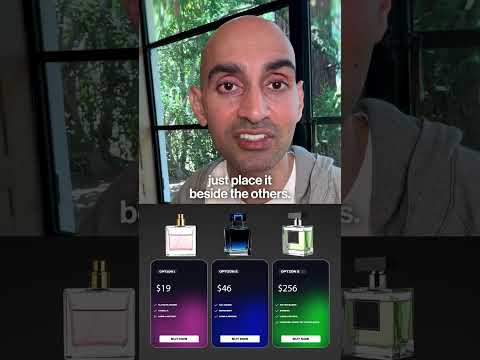
Imagine someone walks into a store looking for perfume. The salesperson shows them one bottle. They like it, but ask to try another.
Now they have two options. That’s manageable.
Then they ask to try a third.
A smart salesperson doesn’t just place it beside the others. She asks, “Which one should I remove first?”
Because once too many similar choices are sitting in front of us, we stop deciding and start worrying about choosing wrong.
Your landing page works the same way.
It shouldn’t explain every service you offer. It should move one specific person toward one specific action.
That’s why, I’m using partner’s GoHighLevel AI Studio to build a landing page, I don’t tell it to create a page with ten different goals.
I give it one audience, one problem, one promise and one call to action.
AI can build the page quickly.
But you still have to give it a clear decision to build around.
Because confused visitors don’t click the second-best option.
They leave.